RSS Feed

a playground of art, photos, videos, writing, music, life


You are here


Random Quote

Talent alone cannot make a writer. There must be a man behind the book.
-- Ralph Waldo Emerson


Blog Posts for "palette"

Page Through Blog: Home Page

Blog Archive by Month | Blog Archive by Story or Tag | Search Blog and Comments

Palette Mixed


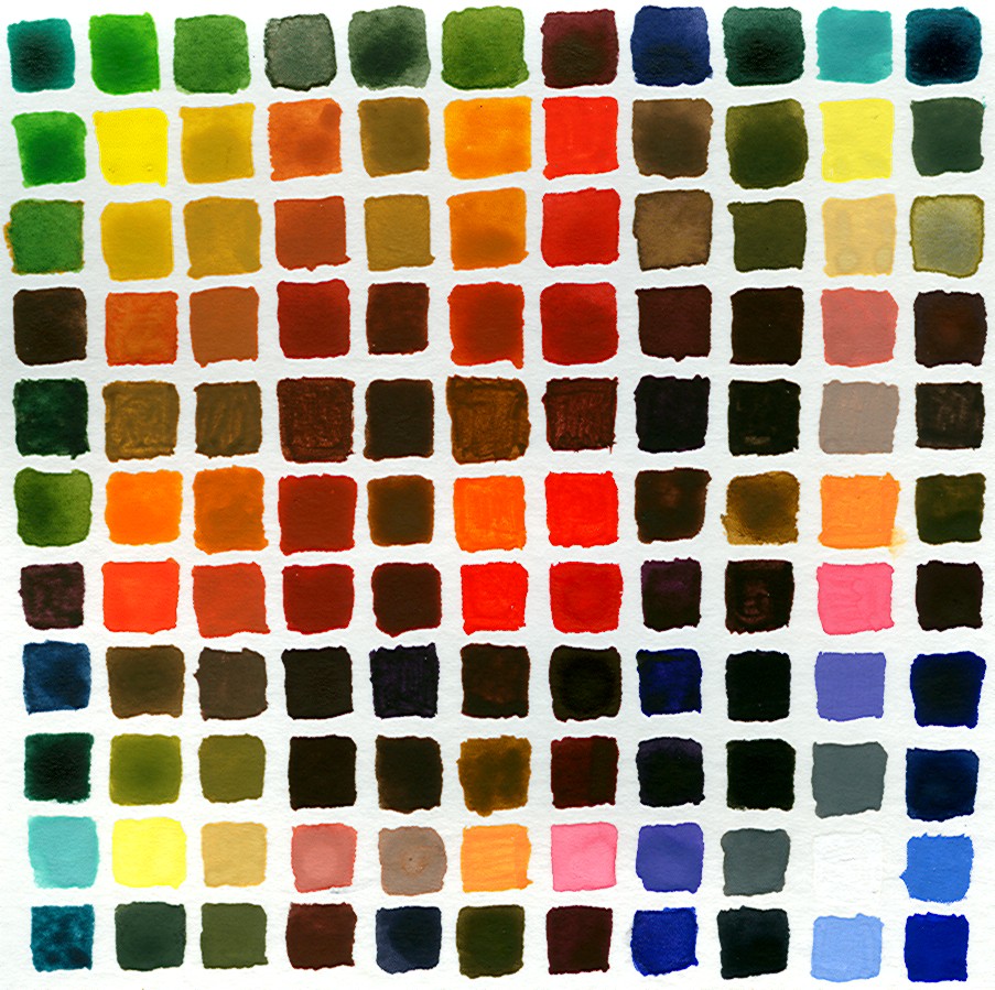
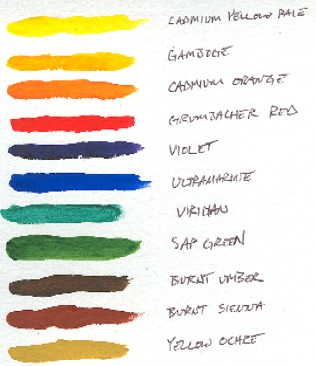
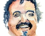
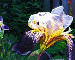
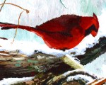
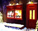
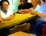
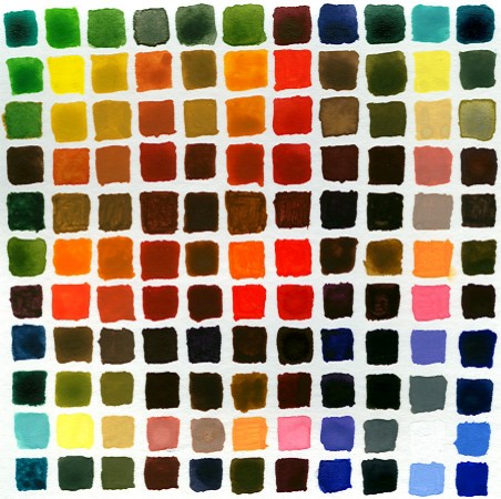
As I mentioned a couple of days ago, after reading Richard Schmid's book on painting, I decided to explore my palette of colors further by mixing each color with each other color and setting the individual swatches side by side. What you see above is that effort.

If you start in the upper-left corner and move diagonally to the lower-right corner, that line of swatches is that of the "native" colors, which are:

  • Viridian (blue-green)
  • Cadmium Yellow Pale
  • Yellow Ochre
  • Burnt Sienna
  • Burnt Umber
  • Cadmium Orange
  • Grumbacher Red
  • Violet
  • Ivory Black
  • Chinese White
  • Ultramarine (blue)

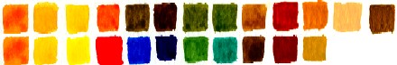
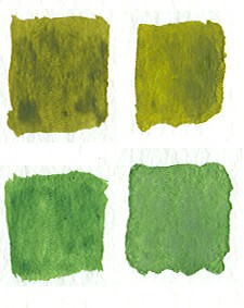
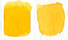
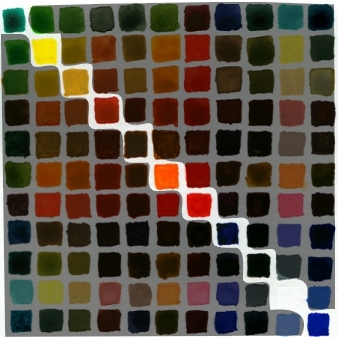
So for each column and row that a native color is found, it has been mixed with every other color and in order. To explain, the 4th row and the 4th column are all colors mixed with Burnt Sienna. The first color mixed would be Viridian, the second Cadmium Yellow Pale, and so on.

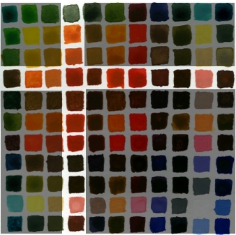
I'm now strongly of the opinion that every painter should do this. I learned a great deal about the strength of some colors, such as red, to easily overpower another color when mixing the two.

Color harmony also becomes more obvious by doing this. I noticed that if you take any four adjacent colors, they create a nice harmony. Doesn't matter which colors. Here's an example:

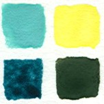
Here you have White/Viridian and White/Cadmium Yellow Pale on the top, and then on the bottom, Blue/Viridian and Blue/Cadmium Yellow Pale. These work together.

Here are a few others:

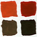
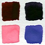
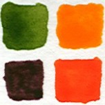
It's because they have colors in common that tie them together. That tie of colors together creates a transition that our eyes can follow. In my first example, I get from White/Viridian to Blue/Cadmium Yellow Pale through White/Cadmium Yellow Pale and Blue/Viridian. Seeing this helped me to understand Schmid's concept of Edges better. An Edge is the transition from one color to another. It can be rapid or slow, steep or shallow. But as long as it is a migration that makes sense in terms of color changes, the eye will accept in a painting.

(Further, Edges will define the depth in a painting as much coloration will. I didn't understand Schmid's point about this when I first read it, but I do now. A stark color transition will insist that there is separation between objects. A person standing in front of a building needs no color transition with the building because there are separate. But when painting a face, there can be no harsh absence of transition, or the face will not appear right to us.)

If you've ever used Photoshop and Microsoft Paint (or Paintbrush), you know the difference between unrealistic edges and realistic edges. Photoshop will produce gradual transitions to another color, as this zoomed-in movement from orange to white shows:

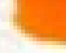
Edges are "smoothed" in Photoshop. Not so in Paint. There you'll see hard edges driven by the pixel. Hence the term, "pixelation."

I've found that I really like the series of colors that share a base color. I plan to explore that more. And I want to use this as an occasional guide when reaching for a color... I was surprised by some of the colors created. Cool exercise.


4 Comments
Read the whole story of "Drawing and Painting"
Tags: richard schmid | palette
by Brett Rogers, 4/23/2005 10:19:57 AM
Permalink


Wax On, Wax Off


Lots of things going on in my personal life, and so I'm up late trying to accomplish one thing that I wanted to do today, which was to work on my palette color selection and mix some paint.

I've learned from reading and from practice that it's not hard to mix any color that you need, but it is hard not to get all excited about the 89 colors that paint vendors push at you. No one actually needs all of those, and with a bit of practice, in theory, a person should be able to mix any color from a good selection of base colors. Tonight, I worked orange. I mixed it with every other color in my initial palette and was surprised by the results.

Here are the colors that I first selected in my palette (plus white and black, not shown in this picture). Orange is on the left.

Now on the top row, here are the same colors mixed with orange, with white and black on the far right. The original colors are on the bottom row.

What struck me about this is how similar the results for the greens and for gamboge and yellow (2nd and 3rd on the left).

So do I need them? I tried to recreate gamboge (yellow-orange) and sap green (the green on the left) with the other colors. Here's how I did:

I used viridian, a bit of blue, and yellow to reproduce sap green. I came real close. Then I mixed it with orange to reproduce the blend and that too was very close. So I don't need sap green.

And the same results with gamboge, although I like gamboge as a color.

One last thing that I want to point out. Richard Schmid, in his book, asserts that colors harmonize just fine when blended with every other color in a palette. So here are the colors I made by blending every color in my palette with orange.

I have to agree with him. Just having the same "base" color for every mixed color brings out colors that all harmonize with one another. Color wheel be damned.


2 Comments
Tags: palette | painting | richard schmid
by Brett Rogers, 4/21/2005 2:25:46 AM
Permalink


Palette


I've been home this morning with my son, Nick, who's had a reaction to the tetanus booster that he received yesterday. His throat constricted a bit, but he could breathe and swallow (although uncomfortably), so I've been watching him. He seems better now.

While home, I decided to weed out the watercolor tubes that I have for what I want in my essential palette of colors. Schmid's book was very instrumental in this, not so much for color selection but for the idea that it is important to do this. Then I can later mix each color with another to see that it's what I need and what it produces.

So here it is:

I initially bought Winsor & Newton's Cotman line of paints, but they're not only a bit streaky, the lids for the tubes are horrible and ill-fitting. I sent an email to Winsor & Newton about it and never heard back from them, so in the strongest manner I can, I dissuade anyone from purchasing Winsor & Newton or Cotman.

I'm using Grumbacher Academy paints and I'm happy with those. Smooth, and the Grumbacher Red is the truest red that I've found. And the lids are lovely!

So, since Nick is better, I'm off to take him to school and me to work. Hopefully sometime this week, I'll get back to painting. Sketching is cool and necessary practice, but I like colors.


6 Comments
Tags: nick | painting | palette
by Brett Rogers, 4/19/2005 12:31:49 PM
Permalink