|
 |
RSS Feed  |
a playground of art, photos, videos, writing, music, life |
|
|

You are here
|

Creativity!
|

Get it!
|

I like it!
|

Fun stuff!
|

About me...
|
| |
|
|
|
|
Random Quote
I'm a Hollywood writer, so I put on a sports jacket and take off my brain.
-- Ben Hecht
|
|
|
|
|
|
Blog Posts for "my painting"
Page Through Blog: << More Recent Posts | Home Page | Earlier Posts >>
Blog Archive by Month | Blog Archive by Story or Tag | Search Blog and Comments
In order from left to right, here are my attempts at painting a flower petal today. The actual photo of the petal is on the right.  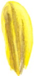 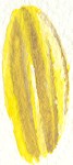 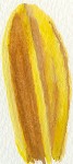  I got closer as I went, with the last attempt being my first time using Arches paper (love it). But even in the last attempt, my yellow isn't deep enough and my shadows aren't rich enough. More brown - maybe even red. The edges, though, are much better - more realistic transition between colors. To paint edges, I've learned, I need room. All of my paintings thus far have been postcard-sized, roughly speaking. Time to get into the larger canvas. |
|
|
|
|
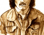
I tried painting a Gerbera Daisy over lunch. It kicked my ass. If I would have had time to do the whole flower, it might have been okay, but where I'm thoroughly dissatisfied with myself is in painting the edges - the transitions from one color to another. My edges, with watercolor, are too stark. A flower's petals are smooth and require gentle transitions. Particularly a daisy... its petals are ribbed. I know what I'll be doing tonight after the kids go to bed. By the way, anyone in central Iowa who would like to try their hand at painting or drawing flowers is welcome to join me this Sunday, May 1. It's from 12 - 5 p.m. Per the web site: "We're painting the town red! And every other color of the rainbow at Sunday Sketchers. Join our group for a special visiting artist lecture, then try your own hand at painting, drawing, or sketching your own original piece of art work in our beautiful tropical dome setting. Juried art contest at the conclusion of the day. Cost is $4.00 per person. Bring your own art supplies." I've got extra palettes and watercolor paints. Should be fun :) You know what I look like (<-- see dopey face at left) and I'll be wearing my red shirt. Hope to see you there! (And a special thanks to Stefanie, who brought it to my attention!) |
|
|
Lots of things going on in my personal life, and so I'm up late trying to accomplish one thing that I wanted to do today, which was to work on my palette color selection and mix some paint. I've learned from reading and from practice that it's not hard to mix any color that you need, but it is hard not to get all excited about the 89 colors that paint vendors push at you. No one actually needs all of those, and with a bit of practice, in theory, a person should be able to mix any color from a good selection of base colors. Tonight, I worked orange. I mixed it with every other color in my initial palette and was surprised by the results. Here are the colors that I first selected in my palette (plus white and black, not shown in this picture). Orange is on the left.  Now on the top row, here are the same colors mixed with orange, with white and black on the far right. The original colors are on the bottom row. 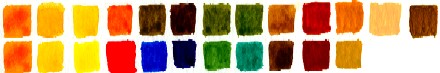 What struck me about this is how similar the results for the greens and for gamboge and yellow (2nd and 3rd on the left). So do I need them? I tried to recreate gamboge (yellow-orange) and sap green (the green on the left) with the other colors. Here's how I did: 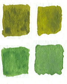 I used viridian, a bit of blue, and yellow to reproduce sap green. I came real close. Then I mixed it with orange to reproduce the blend and that too was very close. So I don't need sap green. 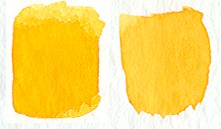 And the same results with gamboge, although I like gamboge as a color. One last thing that I want to point out. Richard Schmid, in his book, asserts that colors harmonize just fine when blended with every other color in a palette. So here are the colors I made by blending every color in my palette with orange.  I have to agree with him. Just having the same "base" color for every mixed color brings out colors that all harmonize with one another. Color wheel be damned. |
|
|
I've been home this morning with my son, Nick, who's had a reaction to the tetanus booster that he received yesterday. His throat constricted a bit, but he could breathe and swallow (although uncomfortably), so I've been watching him. He seems better now. While home, I decided to weed out the watercolor tubes that I have for what I want in my essential palette of colors. Schmid's book was very instrumental in this, not so much for color selection but for the idea that it is important to do this. Then I can later mix each color with another to see that it's what I need and what it produces. So here it is: 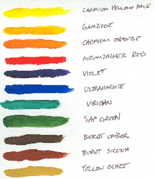 I initially bought Winsor & Newton's Cotman line of paints, but they're not only a bit streaky, the lids for the tubes are horrible and ill-fitting. I sent an email to Winsor & Newton about it and never heard back from them, so in the strongest manner I can, I dissuade anyone from purchasing Winsor & Newton or Cotman. I'm using Grumbacher Academy paints and I'm happy with those. Smooth, and the Grumbacher Red is the truest red that I've found. And the lids are lovely! So, since Nick is better, I'm off to take him to school and me to work. Hopefully sometime this week, I'll get back to painting. Sketching is cool and necessary practice, but I like colors. |
|
|
Take a look at the following image:  Could you draw that? I suspect that just about anyone could draw a line that looked reasonably similar to it. How about this one?  A little more difficult, but I still believe that almost anyone could come very close to drawing lines that looked like these. Now here's the thing - these are taken from a larger picture that I've broken up into squares. This is the entire composite: 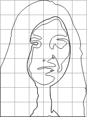 If I removed the grid, it might seem harder to you to freehand draw it. But broken into a grid, it appears much easier. In fact, I suspect that if I left the grid in place, most people would see their way to a step-by-step, or should I say square-by-square, approach to draw this woman. If I had started by asking you to draw the woman shown below, and you didn't believe that you had any skill in drawing, you might have balked.  But if you know of a method that allows you to get there, line by line and step by step, you could then believe it. Here she is "painted," or colored in from the wireframe squares image shown above.  If you had painted such a picture of her, how would you feel about your talent? Painting isn't about talent. It's about knowing the process and then doing it. It's my opinion that anyone can draw and/or paint. Those who wish they could but don't think that they can just need to know how. |
|
|
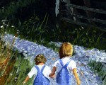
It's not often that I have a difficult day at work. But today started out with a heated discussion and then the morning slid from there. Lunch, which is my painting break, was a very, very welcome respite and started a nice turn-around for me. On lunch, I wanted to work more on folds of clothing and monochromatic shading, so I typed "woman coat" into Google images and for some reason, a picture of children came up. The girl in the picture was so delighted and happy that I wanted to absorb her mood. She felt like sunshine to me, so I tried yellow. I like the result. It fit her well. 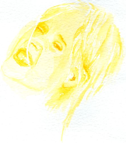 You can click on her if you want to see the source photo. And from there on out, the day was great. Tonight, I should turn on the Graffiti portion of the site. Let's see how far I get. |
|
|
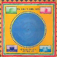 My favorite song at the moment is "This Must Be the Place" by the Talking Heads. I owned the Speaking in Tongues album when it first came out in the early 80's, but I swear I never liked David Byrne's compositions and texturing as much as I do today. Where was my head back then?? My favorite song at the moment is "This Must Be the Place" by the Talking Heads. I owned the Speaking in Tongues album when it first came out in the early 80's, but I swear I never liked David Byrne's compositions and texturing as much as I do today. Where was my head back then??
In "This Must Be the Place," there's one part of the song that goes: "Home is where I want to be, but I guess I'm already there." No idea why, but that's sticking with me... and I don't usually notice lyrics. Mr. Byrne - he's a genius. It's funny how related music seems to painting lately. The layers and textures... I can see the transparency of the song as though it were displayed in front of me, like watercolor washes. I had lunch with a friend of mine today whom I've known for years. His birthday is in two days and we take each other out for lunch on our birthdays. We stopped at the restaurant where a childhood friend of mine works. They'd never met, so I introduced them. It's odd, but I find a lot of common threads running together lately. From "Once in a Lifetime," I hear in my ear, "You may ask yourself, 'Where does that highway lead to?' You may ask yourself, 'Am I right? Am I wrong?'" Someone once told me that we only get angry when we don't get our way. I find that painting reduces my desire to change the world, as I've sought to do in the past. Instead, I want to observe it as it is and enjoy it for what it is. I think everyone should try painting. It's changing my life. |
|
|
My mom, god bless her, loves my artwork and bought me some watercolor paper for Christmas. She went to the local art store and, at the direction of the salesperson, spent a mint. One of the items she bought was watercolor canvas, a concept I'd never heard. It is essentially that: very thin canvas, supposedly designed to be used for watercolors. I've never tried it, and my initial thought was, "Gee, how does that stuff stand up to water??" But I figured I would give it a go in painting the guy and his plants. 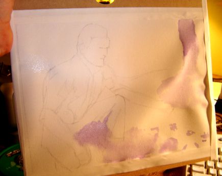 Some of you have written to me and mentioned in the comments that you might try your hand at painting. As you can see, "watercolor canvas" can't even stand up to the most simple of washes. Watercolor canvas is an oxymoron and a product disaster. Unless you're hoping that your paintings turn out in 3-D relief, skip the farce of this "paper." My recommendation: go for the 140 lb paper. I've been using Winsor & Newton paper, and it's fine. Use 300 lb for finished works that you want to hang somewhere. But steer clear of anything else. It wasn't all wasted effort though... I'm getting better at drawing this guy and I'm strengthening my sense of how I want to paint this. |
|
|
Hue, Value, and Intensity |
 Betty Edwards writes in her book, Color: "Everything about color has to do with relationships, and the questions you need to ask in order to understand color are all about relationships." Betty Edwards writes in her book, Color: "Everything about color has to do with relationships, and the questions you need to ask in order to understand color are all about relationships."
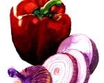
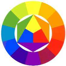
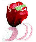
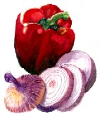
What you see at right is a color wheel. If you start with the three primary colors, and then add the secondary colors (giving you six colors), and then add the color that is a mixture of the adjacent primary and secondary colors, you then have twelve colors. What combinations of colors please the eye? Studies have found that opposites do. For example, purple and yellow, or red and green. To show that this is true, several people have complimented my current painting, a still life of a red pepper and a sliced red onion. The red pepper is a bright red with a green stem. The onion is purplish with yellow highlights. This was quite by accident on my part - I was simply painting what I saw. But as I step back from it, I do see that aspect. Artists also find that triads - creating a color and then using the fourth from it and then the fourth again - creates a harmonious mix. Red, yellow, and blue are one example. Orange, purple, and green would be another. I doubt that it has anything to do with this, but music also has twelve notes between octaves. To create a harmony, you use not the opposite or triads, but rather fifths or sevenths. But there's a rhyme and a reason to understand harmony in both color and music. So... I wonder how this idea of hue (a color from the color wheel), value (light or dark), and intensity (bright or dull) transfers to harmony in friendships and marriages. I'm too tired now to consider it more, but I'll be thinking of it... ETC: More in the comments... |
|
|
Still Life, Um, Standing Still |
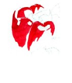
I took today off work, which was fabulous. I slept for a while, hung out with my kids, who are on spring break starting today, and I painted. Here's the current red pepper and onion painting, with a view of the transitions between each sit down. 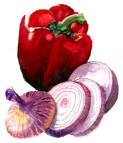 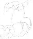
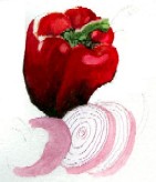
 But now what? It needs a background, but I don't know what I want to do with it... cutting board? Plate? Dinner table? Fade to white? Beats me... I'll noodle it through. Aaron has his friend, Sonny, over and they are conquering the Covenant in HALO 2. 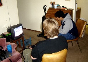 He'll be staying for dinner tonight. Should be a great evening here at home. I am so glad that I took the day off. ETC: The kids all like this painting. My daughter, who is smart about things like this, suggests that I paint a black-and-white tiled countertop. That seems smart to me because it's a good background without detracting from the color of the pepper and onion. ETC, ETC: After scrounging through Google images and doing some sketching, I think a gray marble tile countertop would be nice. A pattern, even as simple as black and white, would pull too much from the focus of the vegetables. |
|
|
|
|
|
|
|